Miami City Ballet - Student Class Portal Redesign
A heuristic evaluation and redesign of the adult student portal, improving online class booking.
Accessibility Evaluation
Usability Testing
UX/UI Design

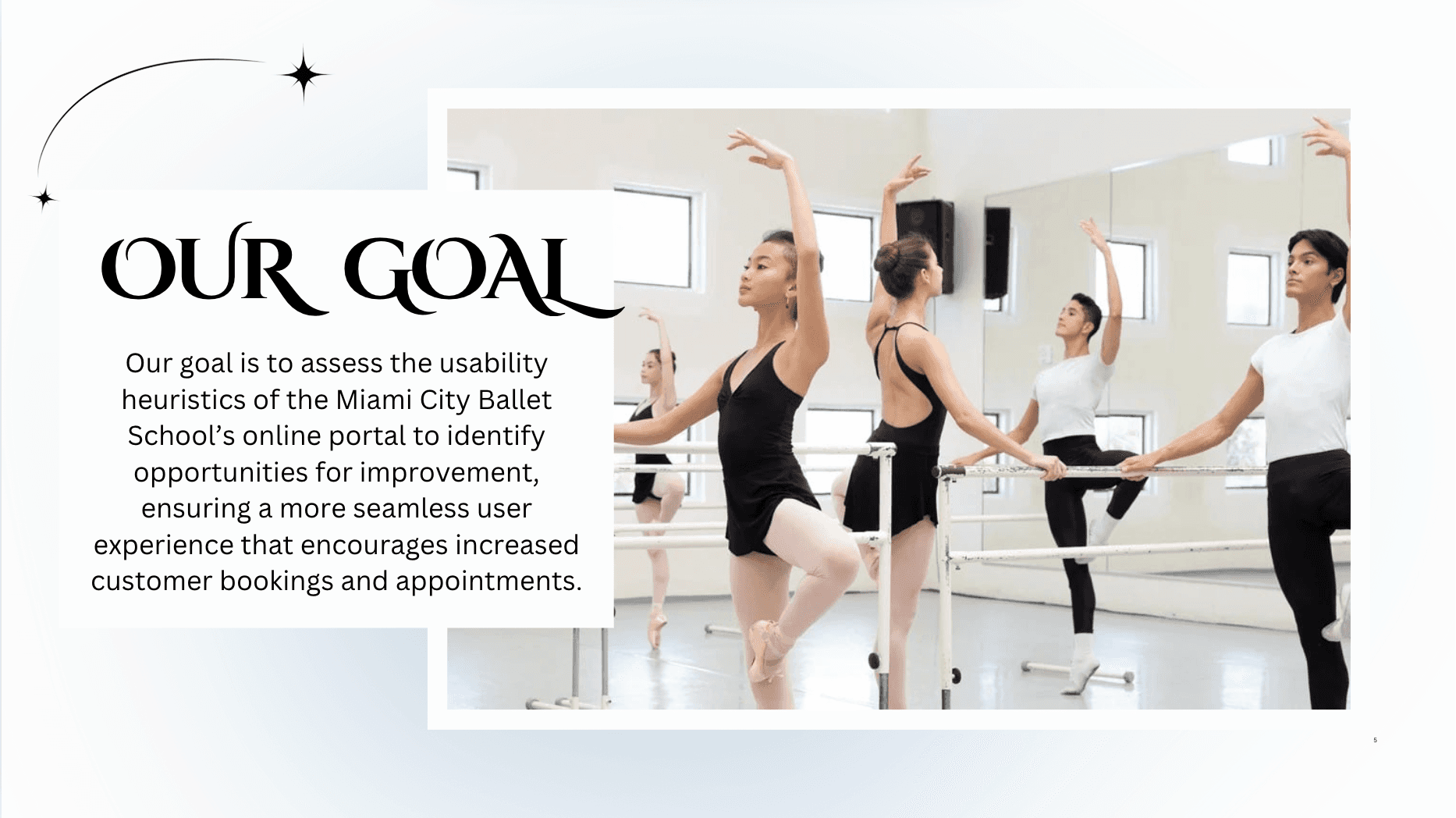
Project Overview
Client: Miami City Ballet School (concept project)
Industry: Education, Performing Arts
Timeline: 2 weeks (2024)
Team: Collaborative project with Pedro Campa
My Role: UX/UI Designer · Accessibility Evaluator · Usability Tester
The Miami City Ballet School offers exceptional dance education, but its student portal presented usability challenges, particularly for adult students booking open classes. This project aimed to evaluate the portal using Jakob Nielsen’s usability heuristics and redesign it for a smoother, more intuitive experience.
✨ Problem
The Miami City Ballet student portal created barriers for adult students booking open classes:
🔎 Confusing navigation and inconsistent labels.
👁️ Low visibility into registration and class status.
⚠️ Weak error prevention during login and payment.
🔄 Redundant pathways and poor visual hierarchy.
These usability issues led to frustration, inefficiency, and missed engagement opportunities.
✨ Approach
To address these issues, we conducted a heuristic evaluation using Jakob Nielsen’s 10 usability principles and translated the findings into actionable design improvements.
Heuristic Evaluation → Identified violations across navigation, visibility, error prevention, and consistency.
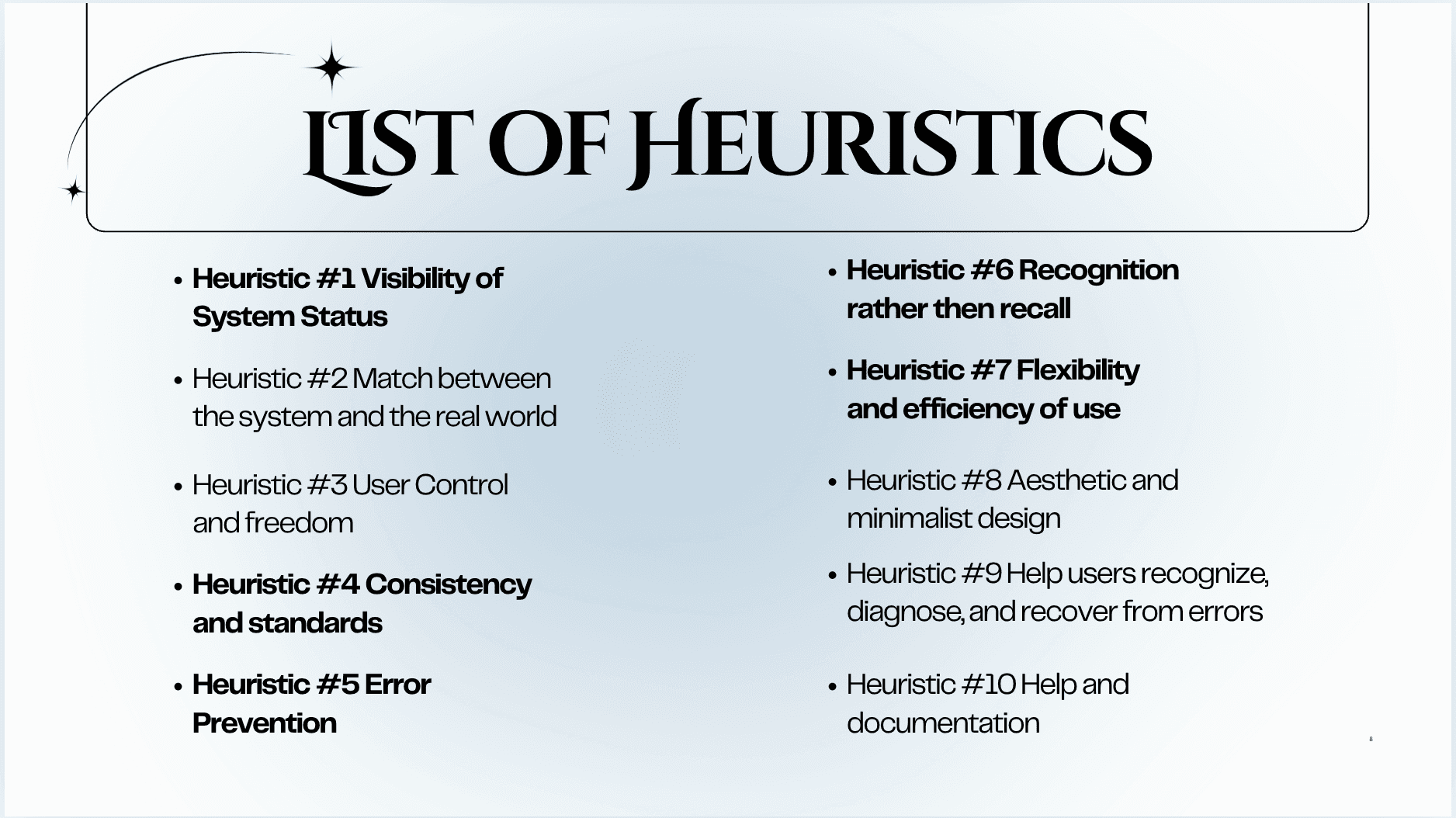
2.Severity Ratings → Severity ratings helped prioritize issues from cosmetic to critical, ensuring we focused our redesign on the highest-impact fixes.

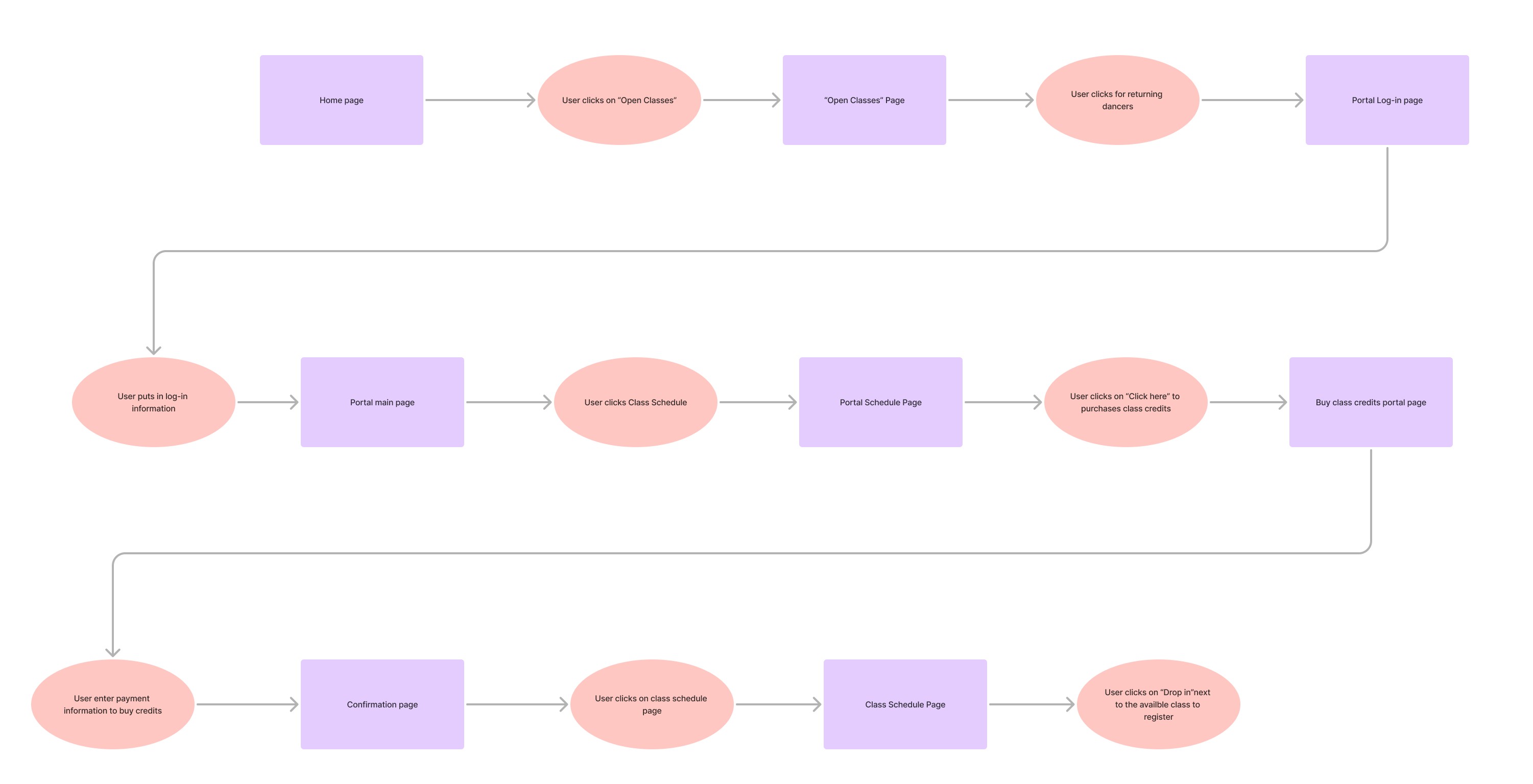
Task Flow Analysis → Mapped the adult student journey for logging in, purchasing credits, and booking a class.
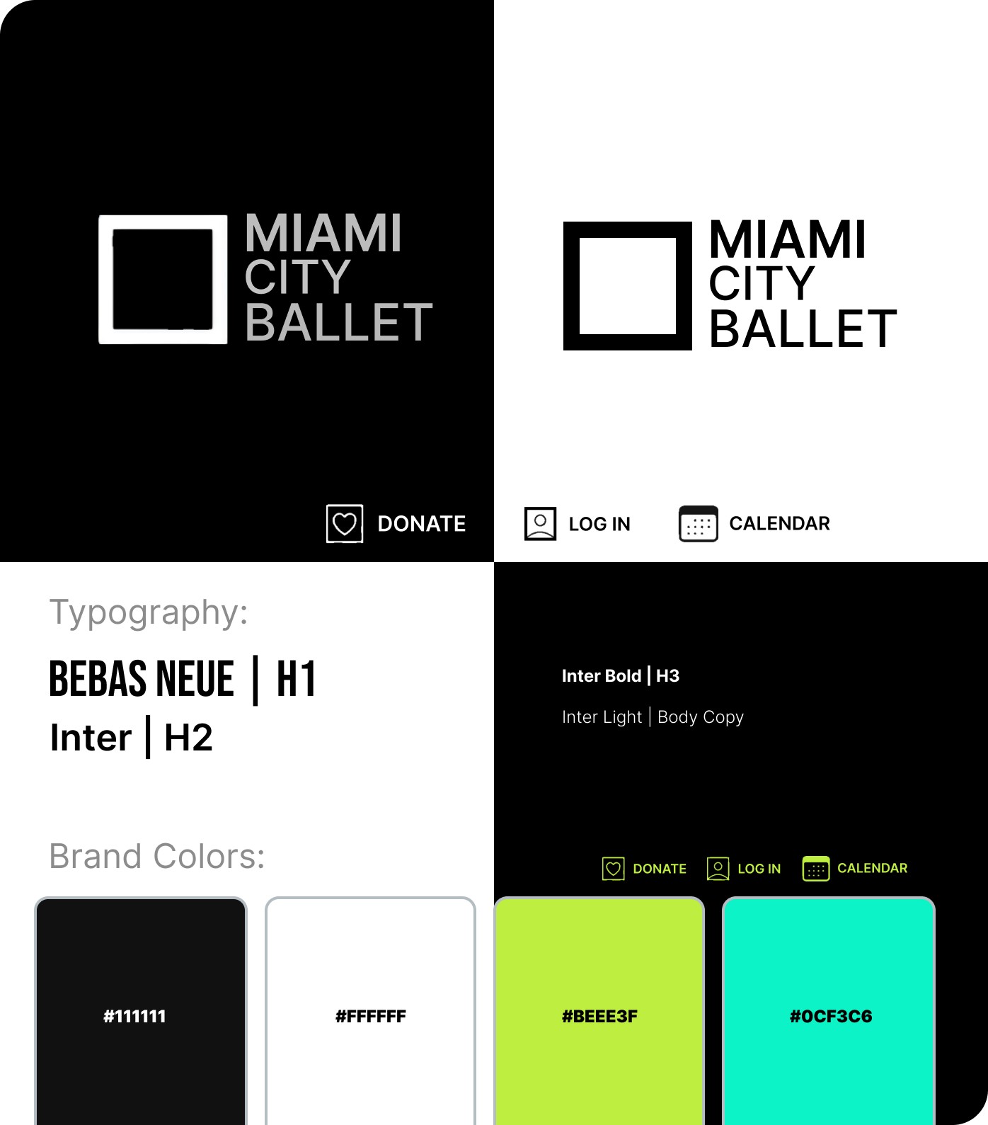
Visual Design → We created a vision board to preserve Miami City Ballet’s brand identity while improving usability.
🎨 Kept: Original brand colors + typography (Bebas Neue, Inter).
🧭 Changed: Navigation, hierarchy, and user flows for clarity.
🔑 Result: A portal that feels on-brand but easier to use.
✨ Solution - Before & After
Problem: Lack of Quick Navigation for Frequent Actions
Heuristic #7 : Flexibility and efficiency of use
A new navigation menu was added with a clear "Open Classes (General Public)" link, making it easier for users to find what they need without extra scrolling, improving usability and navigation.
Before & After

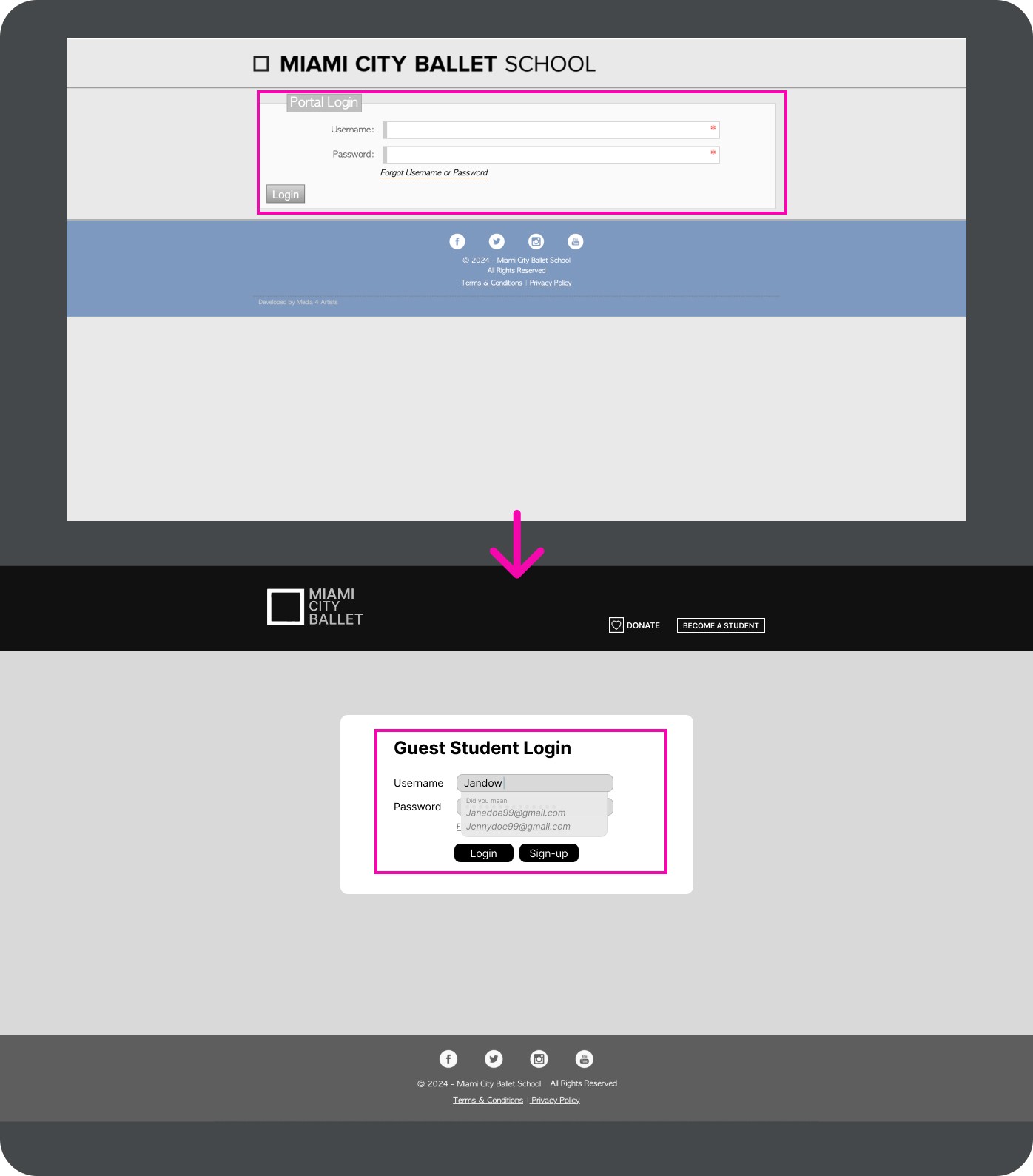
Problem: Preventing Login Errors
Heuristic #5: Error Prevention
The login process was redesigned by introducing a "Guest Student Login" option, making it easier for users to access without requiring a full account. This change prevents login errors and enhances accessibility for first-time or casual users.
Before & After
Problem: Inconsistent Navigation and Design Standards
Heuristic #4 Consistency and standards
The updated design improves consistency by introducing a clear side menu with uniform labels and simplified navigation. Improved typography and layout create a more cohesive and user-friendly experience.
Before & After
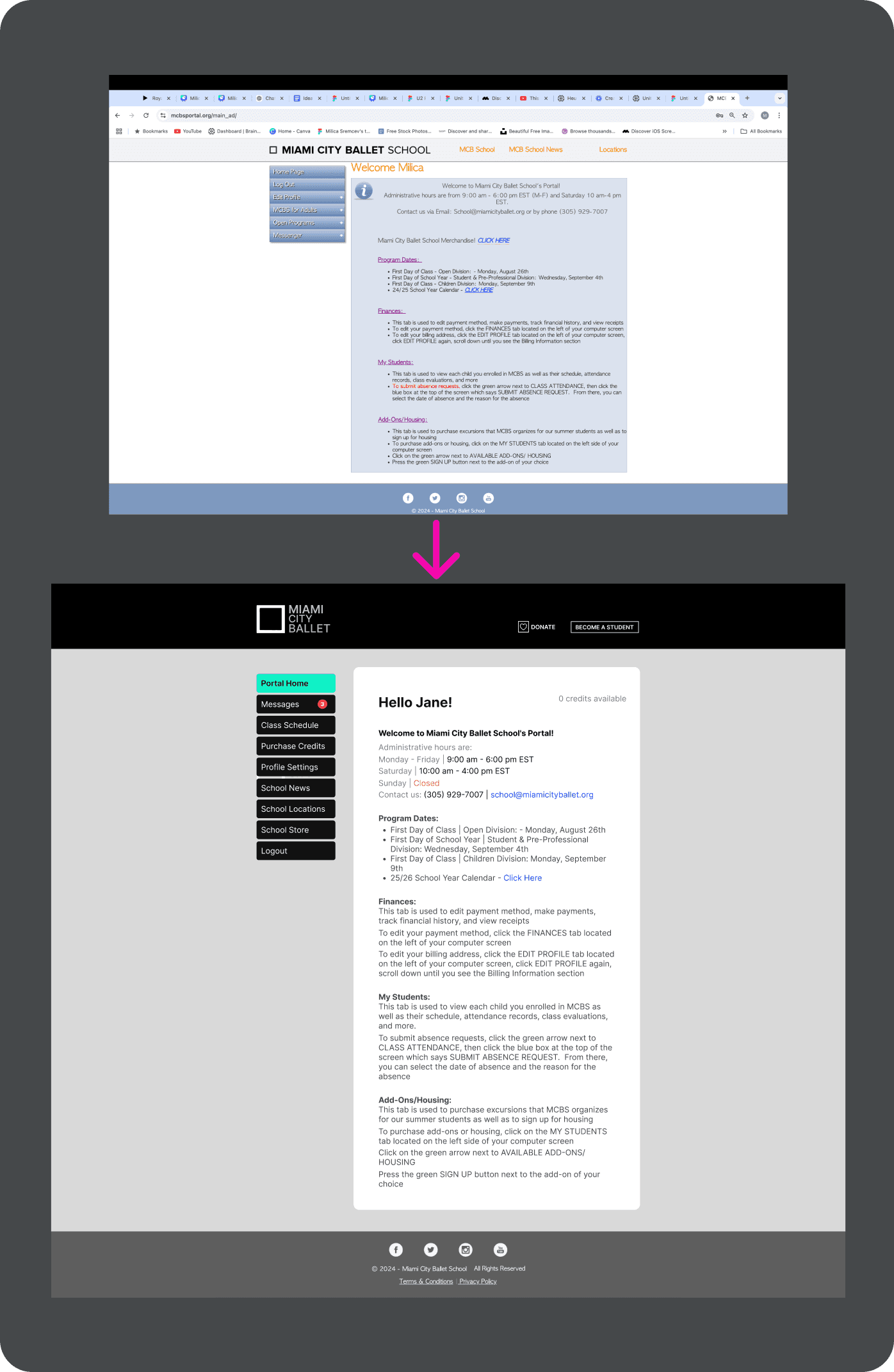
Problem: Confusing Class Registration Status
Heuristic #1: Visibility of System Status
The redesign simplifies navigation with a clear side menu and consistent labels, improving access to key sections like "Class Schedule." Enhanced typography and a cleaner layout create a more user-friendly and intuitive experience.
Before & After

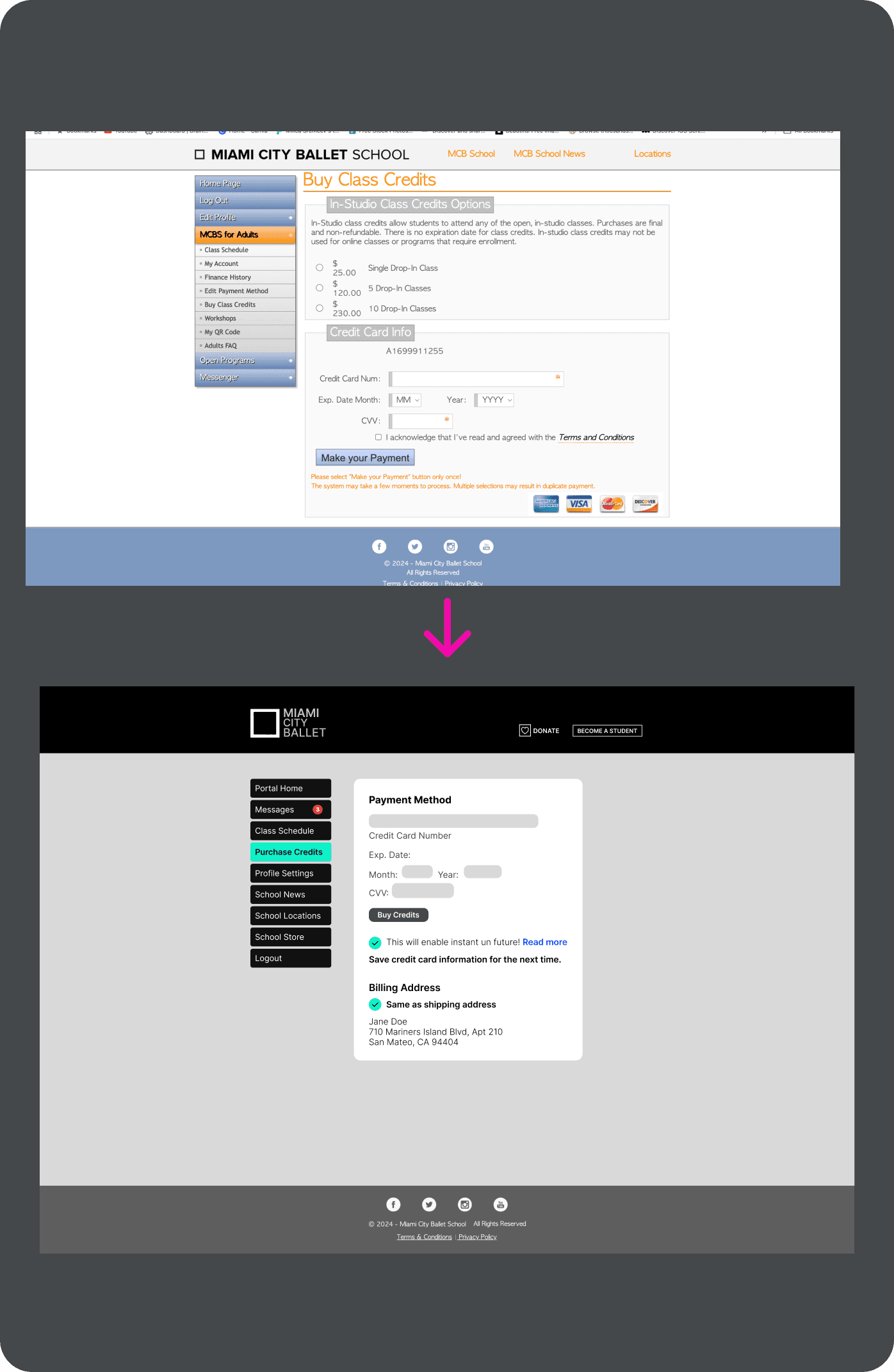
Problem: Lack of input guidance in payment fields
Heuristic #6: Recognition Rather Than Recall
The updated design improves consistency by introducing a clear side menu with uniform labels and simplified navigation. Improved typography and layout create a more cohesive and user-friendly experience.
Before & After
The Final Prototype → [View in Figma]

✨Outcomes & Learnings
Reduced usability issues by aligning the design with Nielsen’s heuristics (visibility, consistency, error prevention).
Streamlined critical flows like class registration and payment, making them faster and less confusing.
Learned how heuristic evaluation and prioritization matrices help focus on high-impact changes.
Next Steps: Conduct usability testing with real students to validate improvements and refine flows further.